

Brilliant
ROLE
Product design
Visual design
DURATION
Q1–Q3 2024
TEAM
1 product lead
2 designers
4 engineers
2 content authors
BACKGROUND
■
Brilliant.org is a learning platform that aims to make a world of better problem solvers, with bite-sized lessons in math, science, data, and programming.
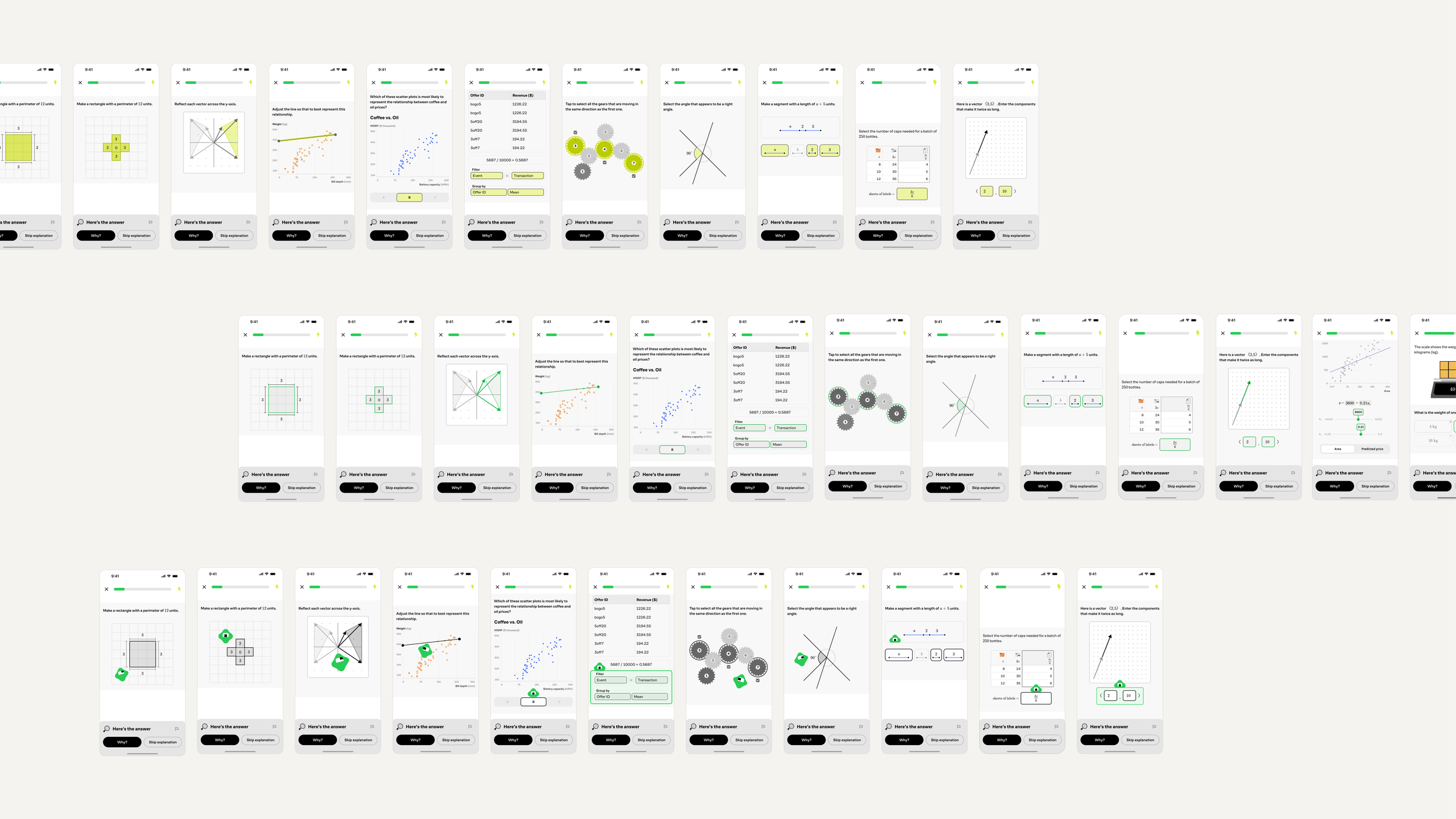
The core feature of a lesson flow on Brilliant are Solvables – interactive questions that gauge understanding and reward the learner with XP upon completing.
The issue at hand was the flow of Solvables took on too many forms – some were retryable, others one-and-done, hints weren’t guaranteed, and CTAs shifted problem to problem. The lack of consistency was disorienting and distracting for users moving from one problem, and one lesson, to another. It was unnecessarily complex for both learners and tech infrastructure at Brilliant.
Goal
■
Unify and simplify the Solvables flow on desktop and mobile to create more consistency across problems and lessons, and help learners move more seamlessly through courses on Brilliant.
PROCESS
■
I audited each type of existing solvable to see what edge cases existed, and what extraneous features could be consolidated into a simplified flow. New flows were stress tested against solvables with varying diagrams, lengths, input types and interactions to ensure patterns were universally supported.
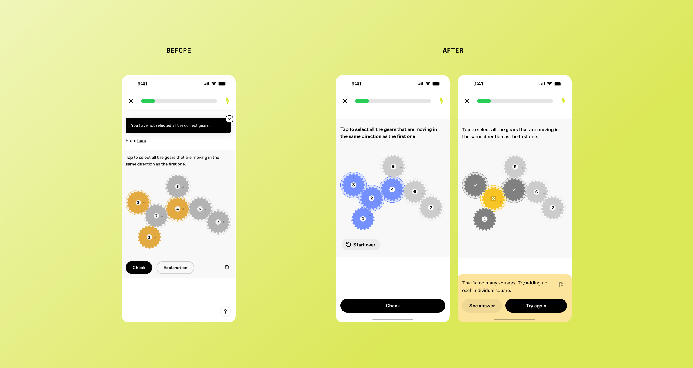
We ran several experiments in product before introducing any new features–like making multiple choice questions retryable, and removing all instances of hints or tips–to see impact on solvable completion or lesson drop off rates.
Too much flexibility in authoring feedback, solutions and explanations meant lack of consistency in content length, number of steps, use of diagrams, etc. As I designed new UI patterns for each piece of the new solvables flow, I collaborated with content authors and developers to provide structured guidelines and minimize the need for one-off features or accommodations.


OUTCOMES
■
+8.1% daily active learners
+7% overall lesson completion
Simplified and predictable flows across all problem types, lessons and courses in the Brilliant content library.
Improved UI ergonomics on mobile, limiting main CTA areas to answer and continue through lessons easily without moving your thumb.
Clearer solvable guidelines reduced need for content authors and developers to create and build one-off content – saving time and energy.
Learners are empowered to try and retry each problem without fear of punishment.

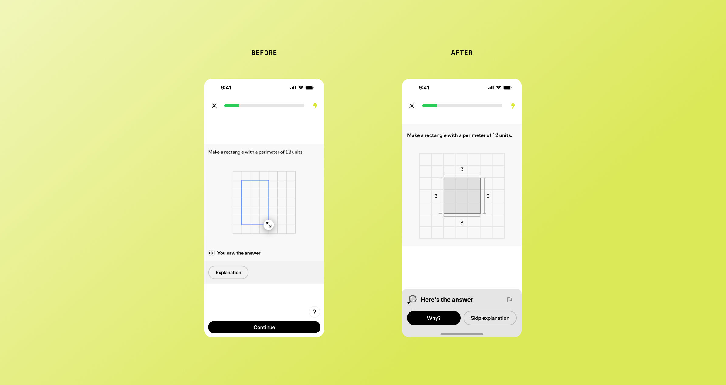


Canonical answers
Once a solvable has been attempted, a learner can choose to reveal the answer via the feedback banner and see a prompted explanation of how to have solved it.
Simplified submission
Each solvable has a unified, predictable submission pattern – including multiple choice questions – which are now multi-try. Previously, multiple choice questions could be incorrect, with no XP gained.

Encouraging feedback
Instead of up-front hints and tips, feedback is now consolidated into a bottom banner, which appears if a submission is incorrect. Feedback encourages mistakes, instead of punishing a good first guess.

